My simplified design process
Sketch out ideas with pen and paper
Turn into crude wireframes via any way possible
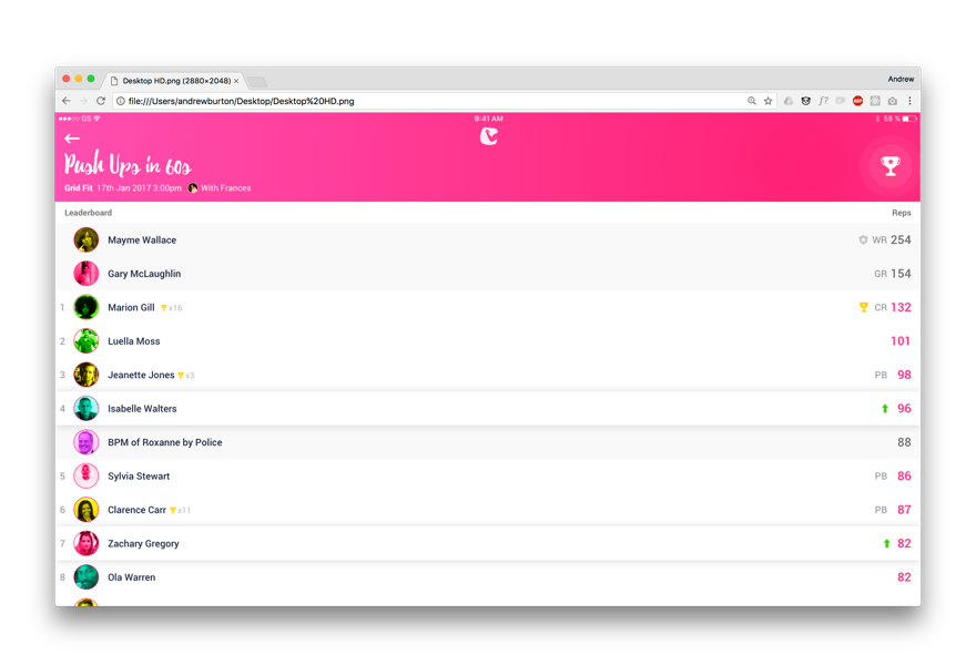
Polish UI with Sketch or Photoshop
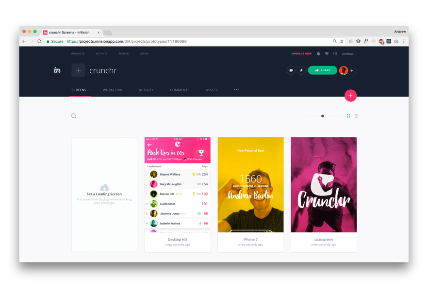
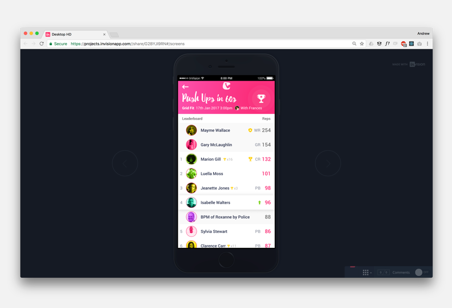
Create a prototype to test, in this case with Invision and HTML/CSS
Sketch out initial ideas
Scattered collection of initial thoughts
The design process isn't as linear as described above but it is similar, it actually begins as soon as the task is set. Initial ideas are jotted and sketched down and either rejected or reinforced by the aforementioned research.
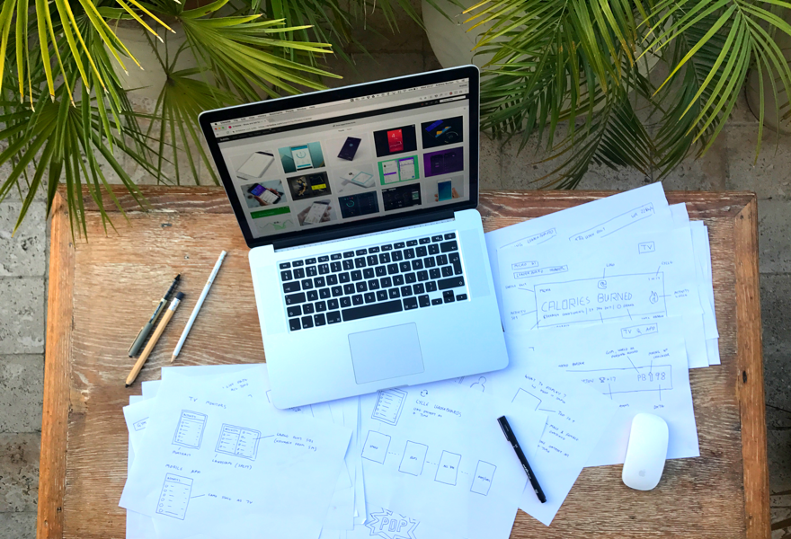
A somewhat posed work in progress shot...
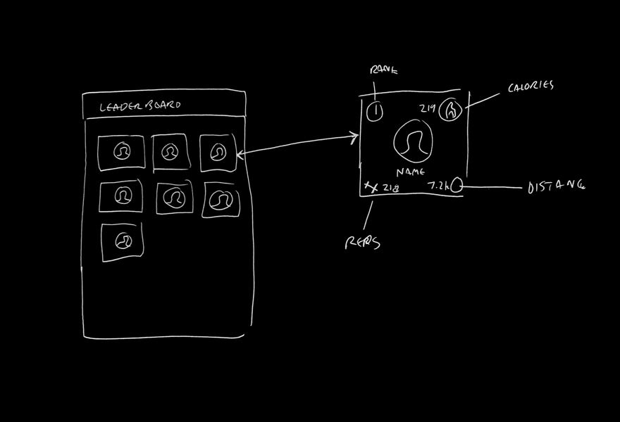
Initial idea for card style leaderboard.
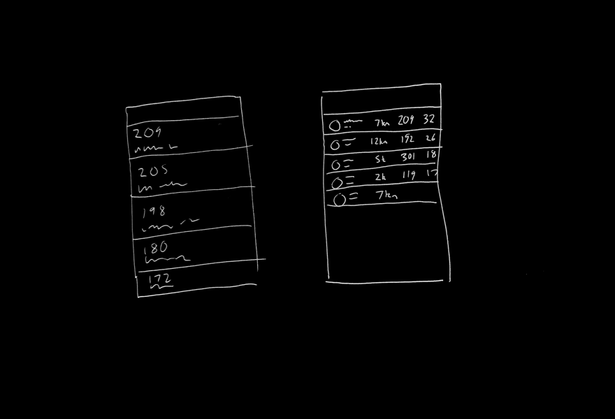
Row style leader board with multiple datums displayed at once. Too busy?
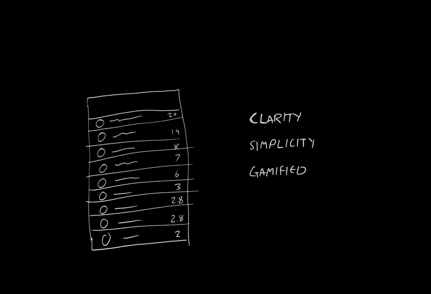
Simplified version showing one data set leader board at a time.
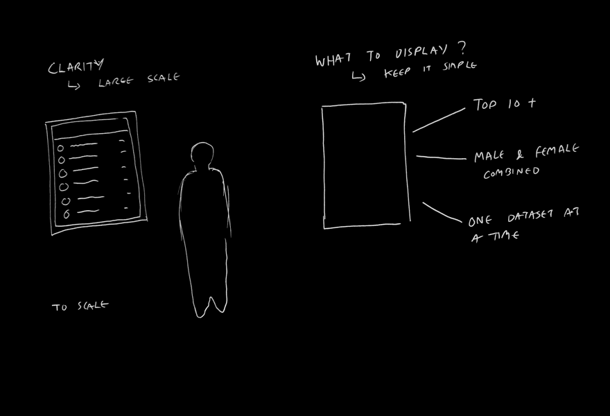
Monitor would work best portrait, simplicty and clarity are key.
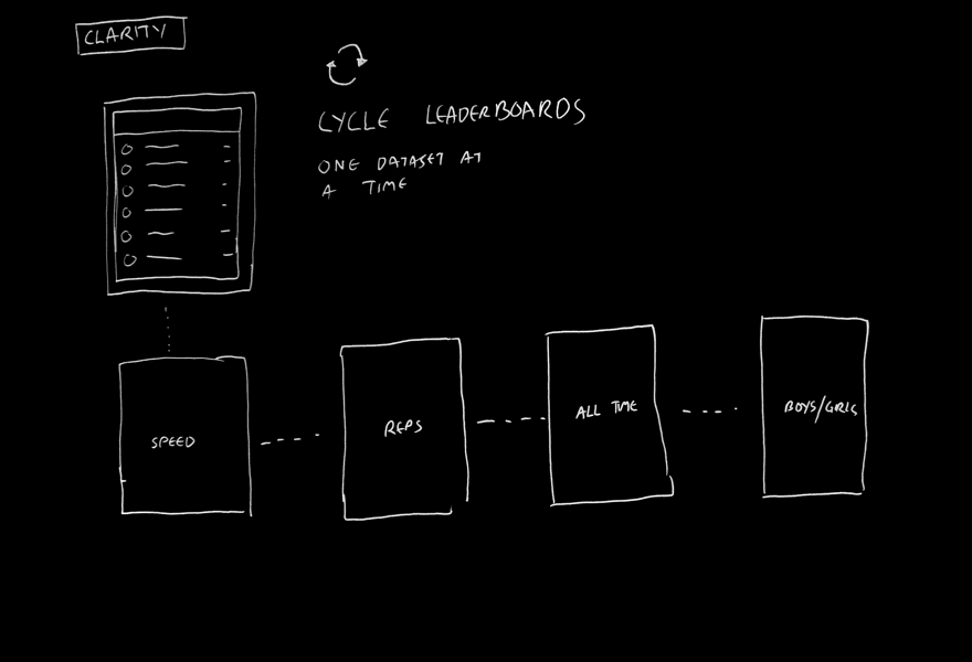
As only one dataset displayed at a time, loop the various datasets on timer. During class PT can choose which.
Draw out crude wire-frames
Connecting the dots
To ensure nothing has been missed from the initial design ideas all screens of the flow are sketched out to give a perspective of the userflow and the micro UI.
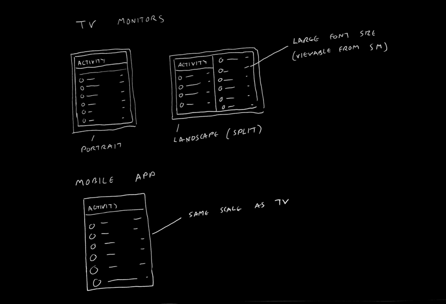
Would work best in portrait but landscape screens work too. Parity between app and monitor display.
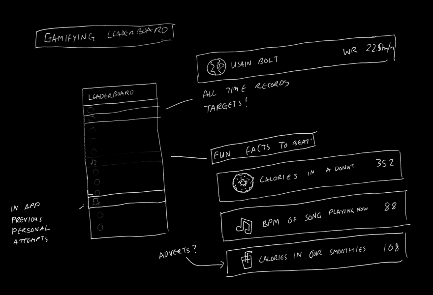
Gamify the experience. Add fun facts and challenges to leaderbooard to beat.
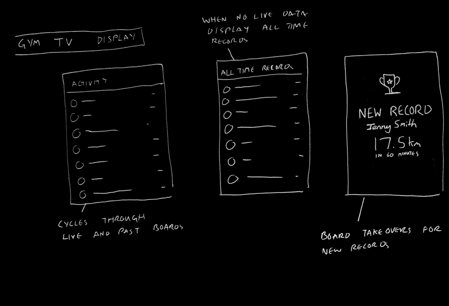
When user breaks a record or achievment, animation takes over the monitor for whole gym to know.
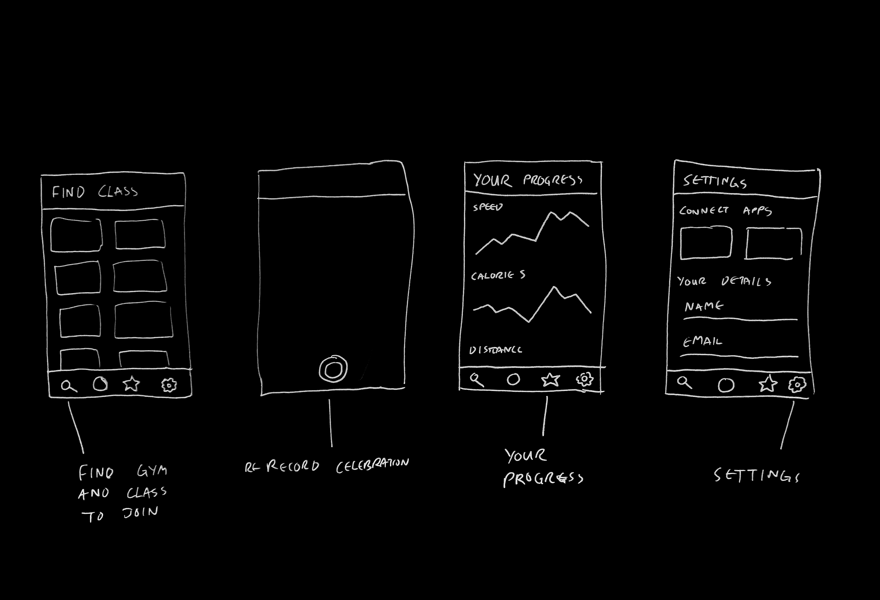
As logged in with app it makes sense to store data there too. Display past achievments and choose classes to join.
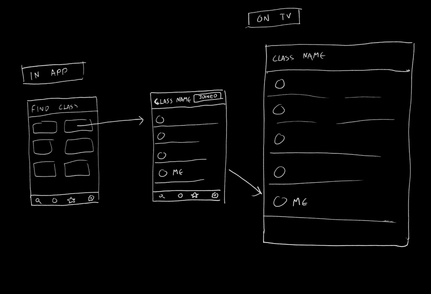
Choose a class and see the leaderboard appear on your app and the gym TV
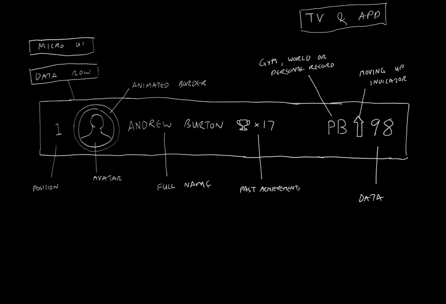
Detail micro UI of table row. Persona, ranking, past and present achievements shown as well as the live datum.
Polish the UI
Thinking about component design early on
Testing designs that are not high fidelity can sometimes taint the reliability of the test. Therefore I dive into Sketch or Photoshop early on to mock up more polished and beleivable wireframes. With a well worn styleguide, this process is often a lot quicker than creating wireframes.
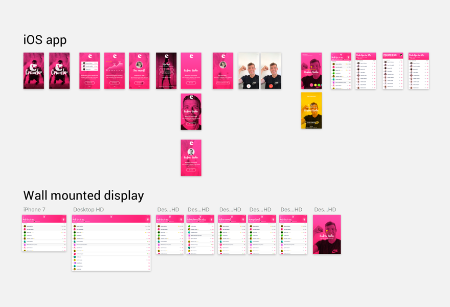
The workboard for the project in Sketch
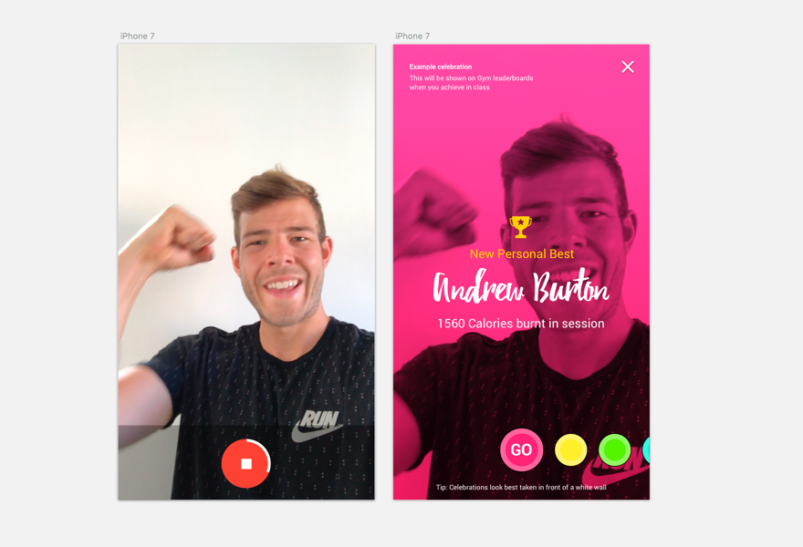
The idea of recording the selfie celebration video for displaying when achievements are made.
See finished example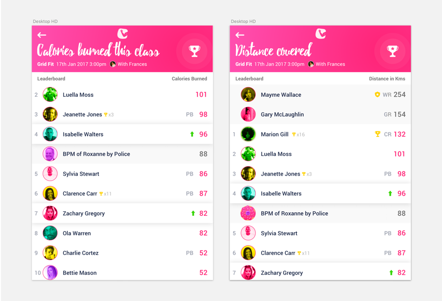
Exploring options of the leader-board datasets
Create a working prototype
Transforming the polished flats into a believable connected system
Creating a working prototype is the best way to test design ideas on real users, with tools such as invision and Marvel it can easily done in minutes. In this case I decided to use Invision and HTML/CSS.
Feedback from team
Whilst designs are progressing I ensure to get constant feedback from my team members (in this case I used my friends again)

"Sharing your scores on Instagram seems like it could be fun"
Nikki Anderton, regular class user

"I'm a bit worried that the scores might not be clear enough?"
Kaspar Iskjær, PT in training

"I like the idea of gamifying the board, making it lively"
