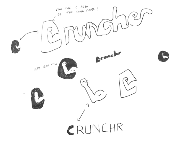
Part 5 of the design process

Implementing the visual aesthetic

Using the conclusions of testing to improve the app through visual design consolidation

Find out more

Creating a brand


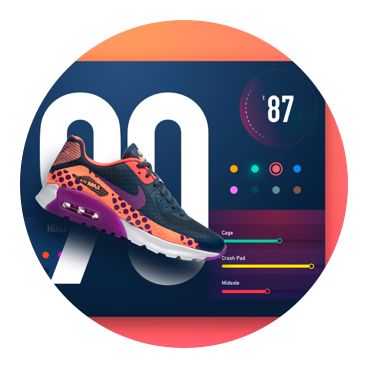
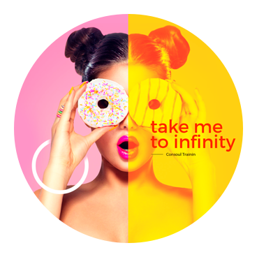
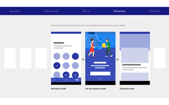
Unifying the visuals and experience

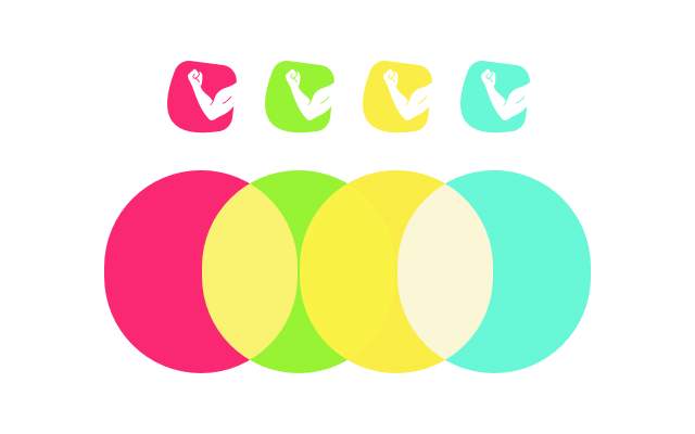
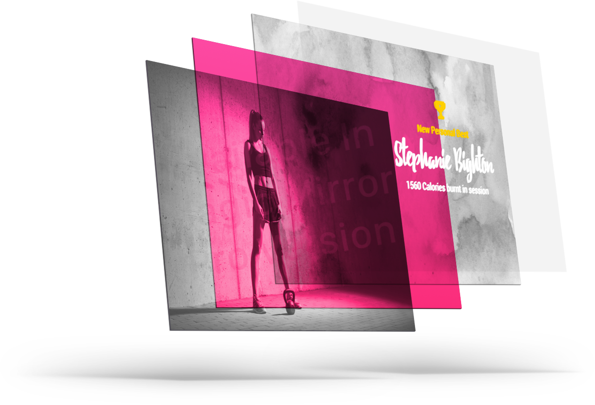
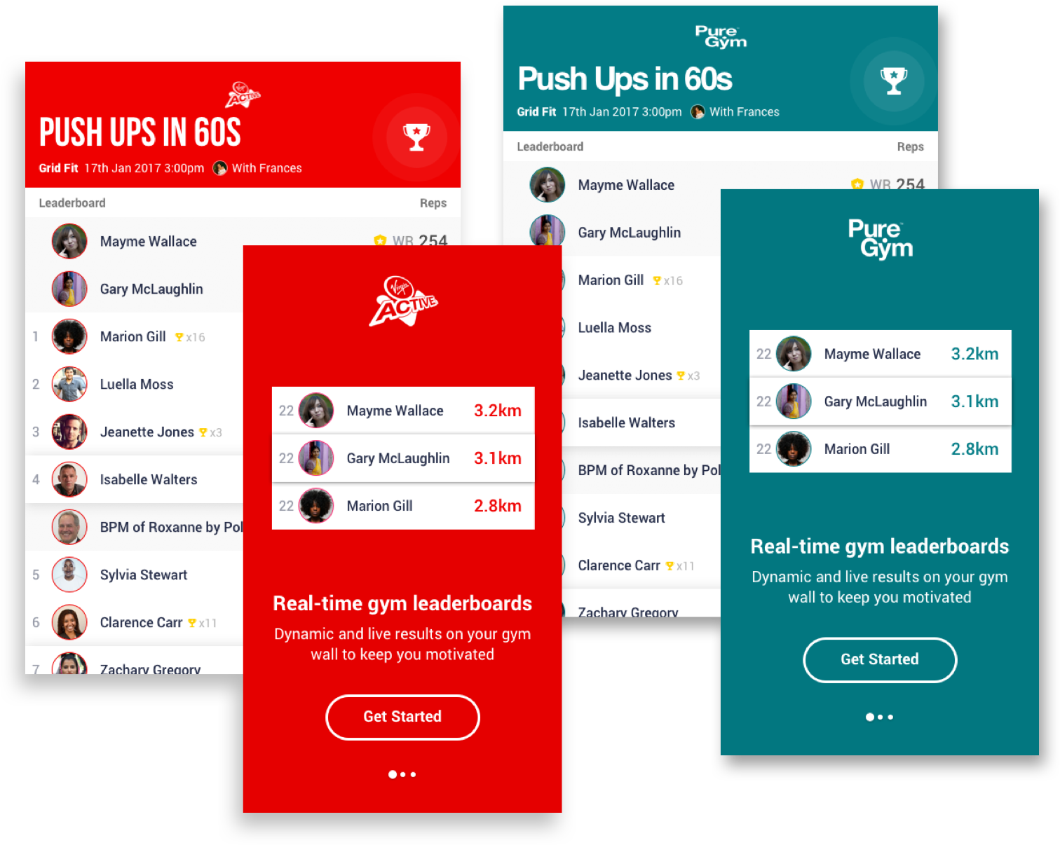
For a visually consistent look and a product that fits the context, it is important to spend time on the a consistent and stretch tested brand. As shown in the user research I wanted to take a fun, gamified approach that could sit alongside the fitness fashions of the day.

Moodboard


UV and neon colours

Fashionable and synonymous with fitness and trainer brands.

Script text

Captures the dynamic, breathless and human attributes of fitness.

Duotone images

A cheap and effective way to apply a unified brand look across a variety of incongruent images.

Fun and gamified UI

To help the addictive nature of competing, joyful and animated UI visuals were important.

Sketches


Sketching out the brand logo.

Fun icons to beat in disciplines?

Adds arcade game element to leaderboard.

Brand


Logo and Name

Abdominal Crunchr or number Crunchr. The name reflects both the determination and pain in fitness and the data heavy nature of the product.

Colour

Agile, flashy and relevant. The colour scheme was chosen for it's distinct nature and their appearance when overlaying images.

Typography

Debby was chosen for the brand's typeface due to it's distinct appearance. Unfortunately it is not that legible so a more readable type would probably have been chosen with more time...

Iconography

Adding the moments of delight to the UI. Branded icons were drawn to enhance the gamified approach.

Wait, no Material?

I thought you might appreicate a break

As the brief did not specify this would be a Google product, I decided to create unique brand and UI components suitable for a stand alone contextual product. Following Material specs to the wire offers little scope for displaying ability (due to the doc's fantastic breadth and scope).
That being said, I have implemented the below and much more from Material's guidelines.

Material patterns utilised in designs


Roboto

A chance to try out Roboto, in reality the iOS app woulduse the system font SF for speed.

Onboarding

I implemented the Top User Benefits for the mobile app onboarding

Spacing recommendations

Wherever possible I followed the exact spacing specs for UI components, lists, grid lists, onboarding etc.

Platform adaption

As I didn't have an Android device to test on, I decided to adapt material principles for iOS

Imagery

Creating a unified apperance through filters

To give a consistent, distinctive and some might say garish appearance, neon filters and texture are applied to images. When a user logs into the app they can choose the filter best for their celebration video.

Actually, scratch the brand...

To permeate the market, it might be necessary to white-label

By changing the color scheme, typeface and logo (a few quick changes in CSS or in the app). The product can be resold to various gym chains that are brand conscious. The UI has been consciously designed to be make this process easy.

Revising layouts post testing


Making visual adjustments post testing

It is important not to completely discard previous work after user testing. As the sample size was very small, subjective and extremely fast, there is no element of certainty in the results. Regardless I went to expand the visual direction with this information.

Changes


Colour scheme adapted to allow for more colours.

Icons added to show PBs and past achievements.

Animated celebration video revised for more legibility.See finished example

Up next

Part 6 of the design process: Presentation

The design and prototype are now ready. So it's time sell it through presentation.